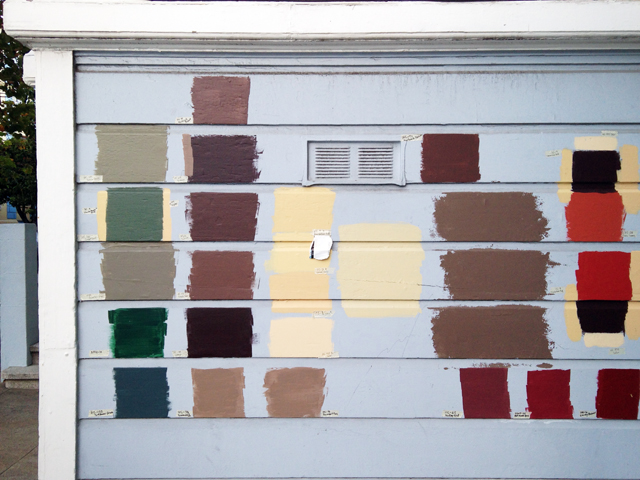
Looks like someone is painting their house. Someone who wants to explore all the options and maybe has trouble making decisions, but also isn’t afraid to use any visual decision-making tool at hand, no matter how obsessive, to help them make up their mind.
Sounds like many a design process that happens in my studio, only right out in public! Do all the neighbors stop in front of this wall to consider the candidates, then gossip and debate among themselves? Or lobby the house’s owners for their favorites?

And what’s your stance on paint color names? Ridiculous marketing gimmick or charming inspiration for daydreams and associative thinking?
Since we graphic designers specify colors using the rather dry system of Pantone numbers, or, even less romantic, formulas in CMYK or RGB, I personally like the change of pace when I get to browse whimsically-named paint chips at the home improvement store. I even once accidentally painted my apartment pale pink, having been seduced by the color name “Teacup” into thinking I’d chosen a delicate porcelain white.
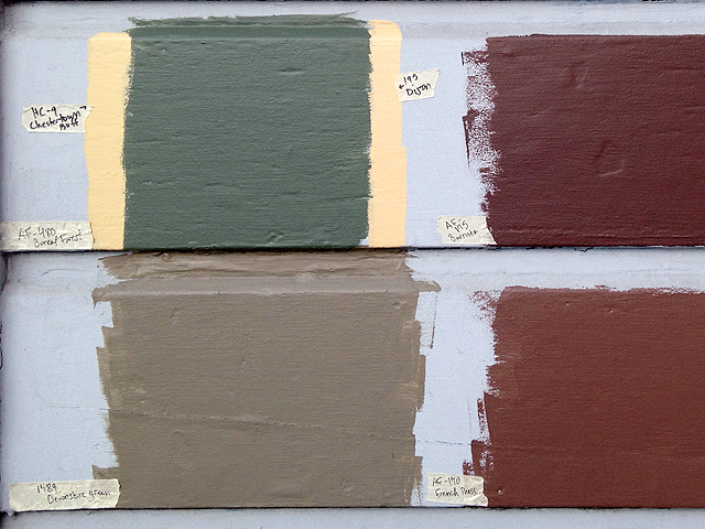
Some of the names above:
Sussex Green
Wenge
Chesterton Buff
Boreal Forest
Devonshire Green
Dijon
Barrista
French Press
Yorktowne Green
Davenport Tan
Hadley Red
Hot Apple Spice
Country Redwood

I know where this house is! Those paint options have remained on that house for a very long time.
That’s funny that you’ve noticed this house too. Thanks for the local scoop. I wonder what’s keeping the people from moving forward with the paint job?
Wait. Thats a painting! I see people a plenty. From behind, looking into the garage. Only the sailor is mirrowed at itss waistline. but then, he’s a sailor. probably standing in the water…
Hm, does anyone else see this?
This is definitely an interesting way to pick a paint color for the exterior of your house!
I agree! As professional painters, how do you usually work with clients to consider colors? I’m curious.