Blog

Pica pica

2013_05_pica_pica_crop.jpg

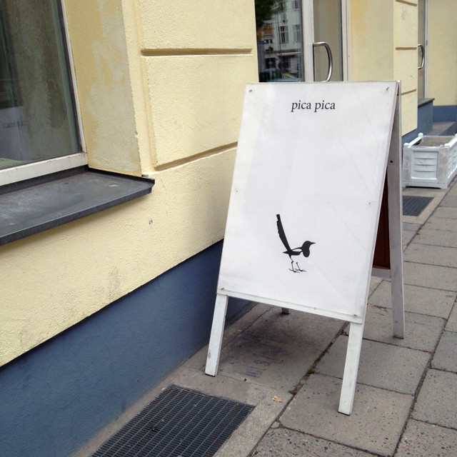
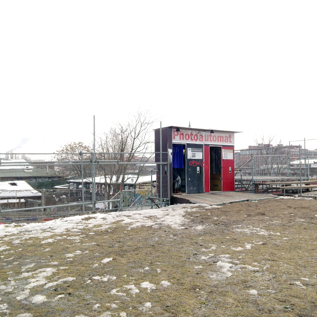
Saw this sign in Berlin-Prenzlauer Berg, for a gallery. Pica pica is possibly my favorite scientific animal name, beating out mus musculus (house mouse) and Rattus rattus (black rat). As you can see from the sign, it’s the name of the European magpie.

I have a magpie couple as neighbors in a treetop near my apartment windows. And I also enjoy watching old East German children’s shows featuring the hand puppets Frau Elster (Ms. Magpie) and Herr Fuchs (Mr. Fox) on YouTube. Here, Frau Elster is in denial about her sunstroke and Herr Fuchs must explain that too much sun can be harmful for her health [in German].

Update: The video I linked to has been taken down due to copyright issues. Official videos can be found on the official Frau Elster and Herr Fuchs page of the website for the Unser Sandmännchen children’s show.


Torta de Polvorones

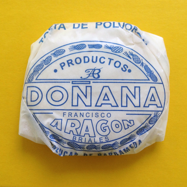
Cookie wrapped in white waxed paper with blue Spanish lettering

I bought this cookie, actually a package of six of these cookies, mostly for the packaging. And because I was only in Spain for a week, no time to hesitate! The blue lettering on the white waxy paper looks like it hasn’t been changed for decades. The cookie itself, powdery with confectioner’s sugar and crumbly with lard, would have been good had it not been for an artificial note of “lemon.” I think I would prefer the Christmas polvorones Anna described on her great Spanish food primer blog I love tortillas de patatas, or, if I felt like eating lard cookies again, I would make Anna’s mantecadas.

To photograph the blue and white packaging, I placed it on the yellow book I was reading, as the colors look smashing together. In fact, the bookmarker ribbon in the book is the same shade of blue. The book is Sand by Wolfgang Herrndorf. The color is great. I’m still working on the book itself.

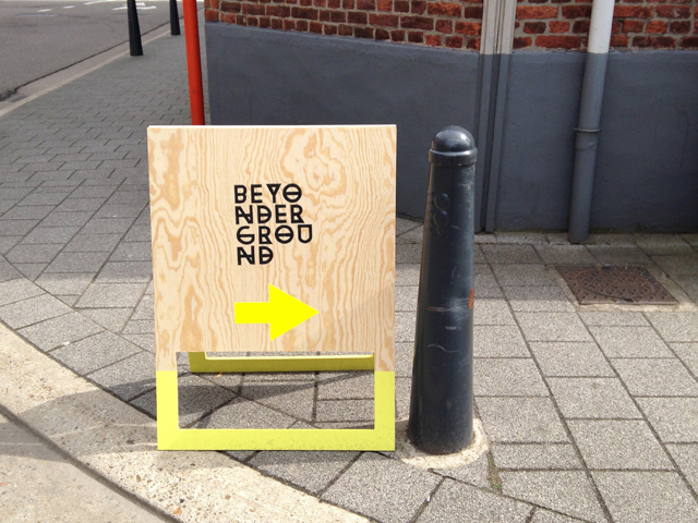
Beyonderground in small-town Belgium

2013_05_beyonderground_sign

Just spent a couple crazy days in Hasselt, a little Belgian town that my friends Pablo and Manon (among others) have decided to put on the map with their own international design festival.

Untitled

Untitled

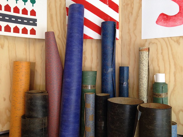
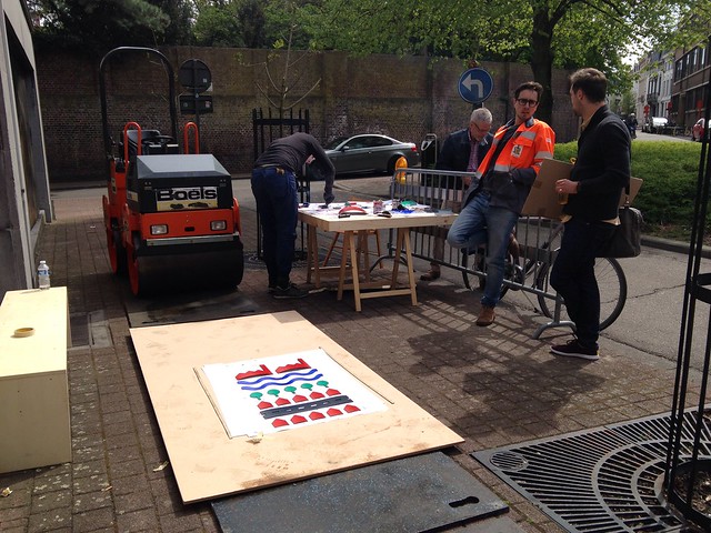
My personal highlights included experiencing giant printing by Letterproeftuin (made possible by a linoleum supplier’s stockpiled scraps and a rented steamroller) and finding out about the Risograph (a sort of copy machine that uses silkscreen technology) with the wonderfully nice people of Rosi

Untitled

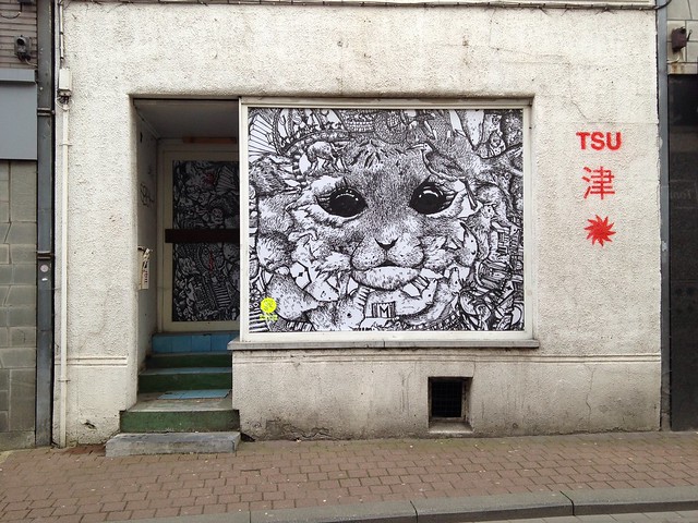
…and hanging out with illustrator Ai Kohno (that’s her work above), in from Japan, and Tracy Widder (Brutal Knitting), from the greater Vancouver Island watery area.

I also got a kick out of seeing presentations from I Like Birds (from Hamburg) and Hattie Newman (from London) who both showed images which they created by building three-dimensional things to be photographed. I got to chat with them a bit too, cool people.

THANK YOU to all the artists and to the organizers for a great “creative festival/nightmare.”

Rock'n'roll Benefit

Postcard reading "Amplify" resting on a record player. Postcard design by Leslie Kuo for Artspace.
Artspace knew they wanted a rock-and-roll theme for their fundraising auction, but they needed a name, a look, and a focus. Since the annual gala is over 10 years old, they needed a new approach to draw a new crowd. I helped them define and promote a rocking party to welcome people of all ages with a fun, glam atmosphere.
First, I designed a custom questionnaire to help them brainstorm, discuss, and define their event, for example:

  • Dream guests? David Bowie, Jimi Hendrix, Björk…
  • Perfect outfit? Gold lamé, skinny ties, velvet smoking jackets…
  • Motto? For those about to rock, we salute you!

The Artspace team brainstormed lots of names internally, but found some too long, others too obscure. They wanted a name that was dramatic and glamorous but also concise and approachable. My solution: Amplify. It ties together all genres of rock, while doubling as a call to action — to amplify Artspace’s impact with contributions.
Stack of postcards reading "Amplify". Postcard design by Leslie Kuo for Artspace.
My design combined sparkly vintage amps with copious glitter and a wry font called Fakir, a quirky, contemporary take on blacklister. A tongue-in-cheek spin on everyone’s favorite rock clichés. The message: this isn’t your momma’s charity auction. Come dressed to kill — and be ready to rock and roll all night!
I supported their in-house team’s implementation the design online and in print. For example, the event website was built by local emerging web developer Miguel Diaz with my feedback:
Screen Shot 2014-10-15 at 17.53.55
The night of the auction saw Artspace filled with art lovers and rock lovers of all ages, terrific outfits, and lively bidding. The gala auction was a rocking success, in every way!
Four people in rock and roll outfits.
 
Photo credits: in the design, glitter texture is by EKDuncan; amplifier photo by Bill Selak. The photos of Amplify guests are by Chris Randall

Good fortune and spring at Yuki’s café

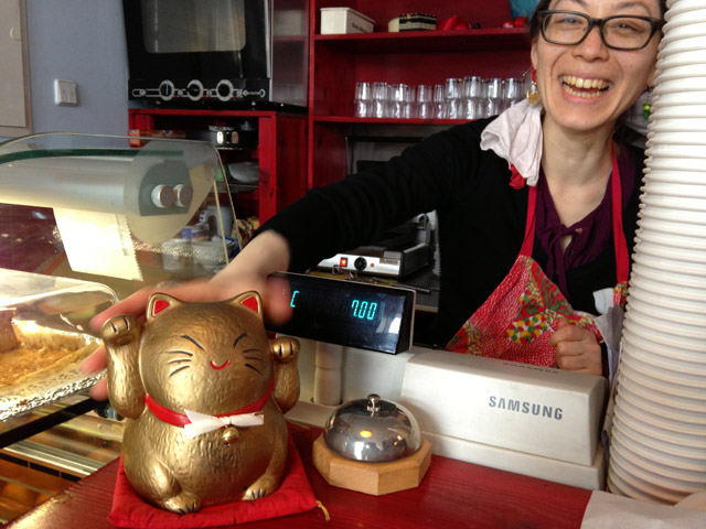
Yuki with lucky cat figurine at cash register

Today I talked of spring with Yuki, whose little café — down the street from my studio — seems kind of like a studio itself. Whenever I go in there she has invented a new treat to bake, like Möbius-strip cookies, or found a new ingredient to put in her tea sandwiches, like pea shoots.

I gave her the bell I’d promised for her maneki-neko, as I had noticed he’d lost his. It was promptly attached with a new ribbon.

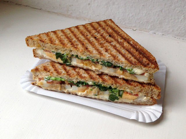
Grilled sandwich with bear's garlic on paper tray

And there were sandwiches with Bärlauch, or bear’s garlic, one of my favorite signs of spring (more at my Urban Plant Research blog). Spring in Berlin will be short and quick this year, we agreed, since it’s starting so late, and we’ll have to hurry to catch the wild garlic, rhubarb, asparagus, strawberries and elderflowers as they blur by… Here’s to finally getting started!

Salzige Gurken (Leipzig Book Fair)

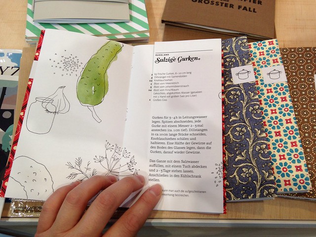
Salzige Gurken

The Leipzig Book Fair (which just ended – it was March 14-17) overwhelms you with books. I spent most of Saturday there and left with my head spinning. Thus my failure to note the name and author of this one, or even which stand displayed it. I only know it was a limited, hand-bound edition of 20, each with a different patterned paper cover, and that it was a student project at one of the art school stands, possibly Fachhochschule Potsdam (?). I liked the illustrations and the ingenious flap, which opens to reveal the same recipe in other languages.